


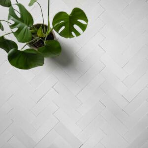
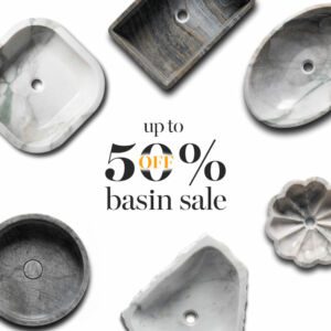

Choosing herringbone mosaic tiles for your bathroom next year is a great idea, if you want to keep on trend.
To make sure your design choices are as fashionable as possible, read on to find out what Pantone has decided is the top colour for 2020.
No.1 Classic Blue
Classic Blue has been on the rise for the past year or two and this year it has taken the top spot. Classic Blue is neither navy or indigo. Instead it is a deep, rich true blue that has stolen many an interior decorator’s heart over recent years and is set to steal many more.
Deep jewel colours had a moment a couple of years ago but it is only classic blue that has stayed on as a popular colour and for good reason. It is not only smart but also vibrant and strong. It goes well with a range of other neutrals such as white as well as popular yellow, greys and even millennial pink!
Announced 4 December, the Classic Blue colour is described by Pantone as “a reassuring presence instilling calm, confidence and connection”.
“Associated with the return of another day, this universal favourite is comfortably embraced,” it added.
Last year’s colour of the year was Living Coral, which Pantone have claimed Classic Blue contrasts with as a calming and tranquil colour. Leatrice Eiseman, executive director of Pantone Color Institute said: “We are living in a time that requires trust and faith,” she added. “It is this kind of constancy and confidence that is expressed by Pantone 19-4052 Classic Blue, a solid and dependable blue hue we can always rely on.”
Here are some other colour trends we think are having a moment in the spotlight.
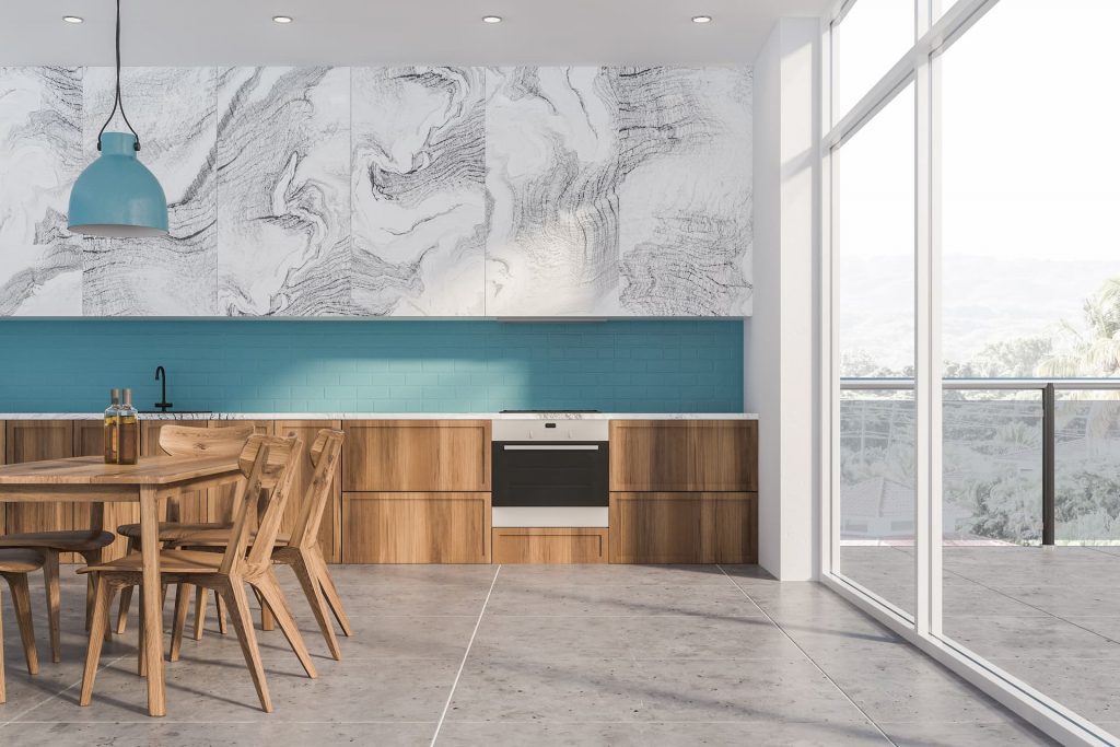
White
While greys have defined interiors for the past decade or two, whites are coming back into fashion. These aren’t just brilliant whites (though some are) but a range of whites that allow people to chose the best white for their palate or lighting. Some paint companies have launched ranges of white to compliment the rest of their range.
These are different from the ‘off whites’ that defined 90s and early noughties interior design, and celebrate the colour white rather than soft tones and pastels.
Pink
Millennial pink or coral, whatever you want to call it, pink hasn’t gone away and actually acts as a perfect buffer to this year’s Classic Blue. Used tellingly in accessories and decorations, pink will still be with us for a long while yet, whether it is in wedding trends or on your tea cup.
Yellow
Millennial pink is still with us but what about Gen Z yellow? This has been having a ‘moment’ for a couple of years now and still is.
This is great for accenting and highlighting designs and also could work very well with Classic Blue in the right combination. Choosing tiles to highlight any room using one of these colours is a great way to finish a room.